Album covers are always fun projects to work on. In today’s tutorial we will take a look at the step-by-step process of creating a conceptual album cover in Photoshop. Let’s get started!
Tutorial Assets
The following assets were used during the production of this tutorial.
Preparation
Working with a certain theme is really important when it comes to dealing with clients. No matter who you work for (family, friend, client) or what kind of theme do you get, it always needs a solid execution to look professional. Even when the concept seems simple.
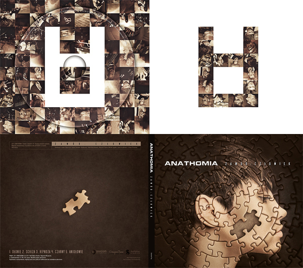
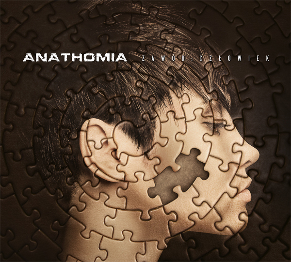
For this project we came up with an "Occupation: Human" concept, as most of the songs tell story about people and their lives. I had many different visions of human feelings trying to hit the best fitting one. Most of those concepts didn’t work out – either I couldn’t find the right photo or it looked pretty bad when I tried to experiment.
Finally I came up with an "in between" conclusion, I found something that wasn’t a feeling, but pointed to being a human. And it was the incompletion of life. That even though everything can be great, we suddenly lack something. Like we miss a piece. A missing puzzle.
When I was 100% convinced of the idea and the right pictures were found, I started the recognition by searching through mass of CDs. It’s always good to get some reference to work with, and I don’t mean coping anyone, as we already have the right concept. What I meant was to take some CD packages and try to compare and imagine how your project could look in reality. And this works really great, by doing that you know how far from perfection you are while creating your piece.
So remember, before you start working, grab a pack of some great CDs and using your own unique concept try to stick to their quality standards.
Step 1
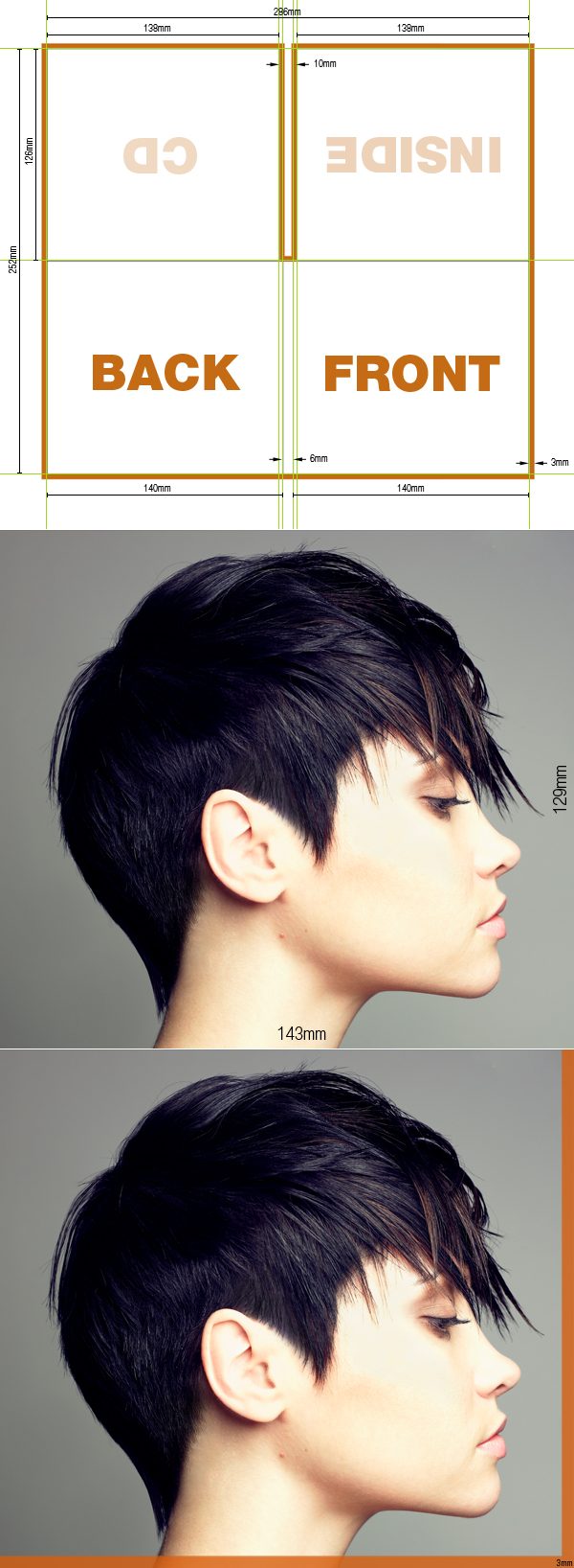
Before we start, it’s good to get the right specification for your CD cover. First image below shows the one I used. The orange line stands for margin that we need to maintain incase there will be some cutting error in printing.
So the first step is to open new document of 3378×3047 pixels (143x129mm), and resolution of 600 pixel/inch. For training purposes you can you the equal size of lower resolution, or just make the document 50% true size.
Now open the image of a girl and place here in the center of canvas. Create a 3mm margin to see if that kind of cut won’t hurt our design. Then just make it invisible.
Step 2
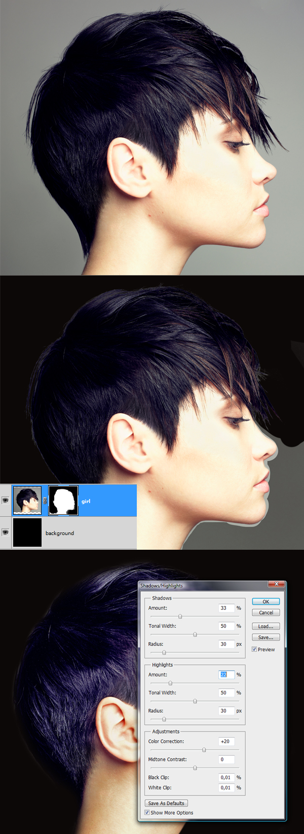
We’re not going to cut the girl from the background, as this isn’t a complex design. So why bother extracting all those hairs. Grab Paint Bucker Tool (G) and pick very dark brown color #0c0807. Then create new layer below the girl and fill it with selected color. Next switch to the girl layer and add layer mask. Paint on it with black color and hard brush to get rid of the background around. Basically we need to blend her with the dark background, so even if you erase too much hair, don’t worry.
When you’re done select the girl layer and go to Image > Adjustments > Shadows/Highlights and follow the settings from 3rd image below.
Step 3
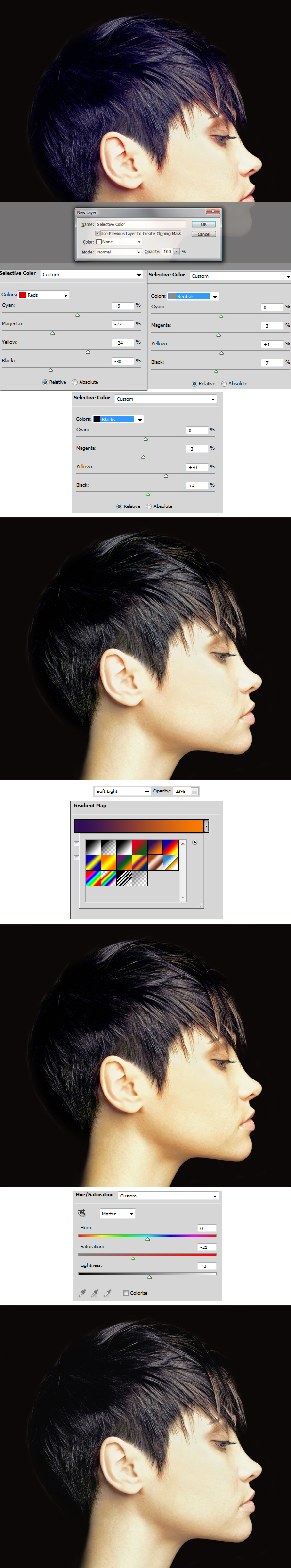
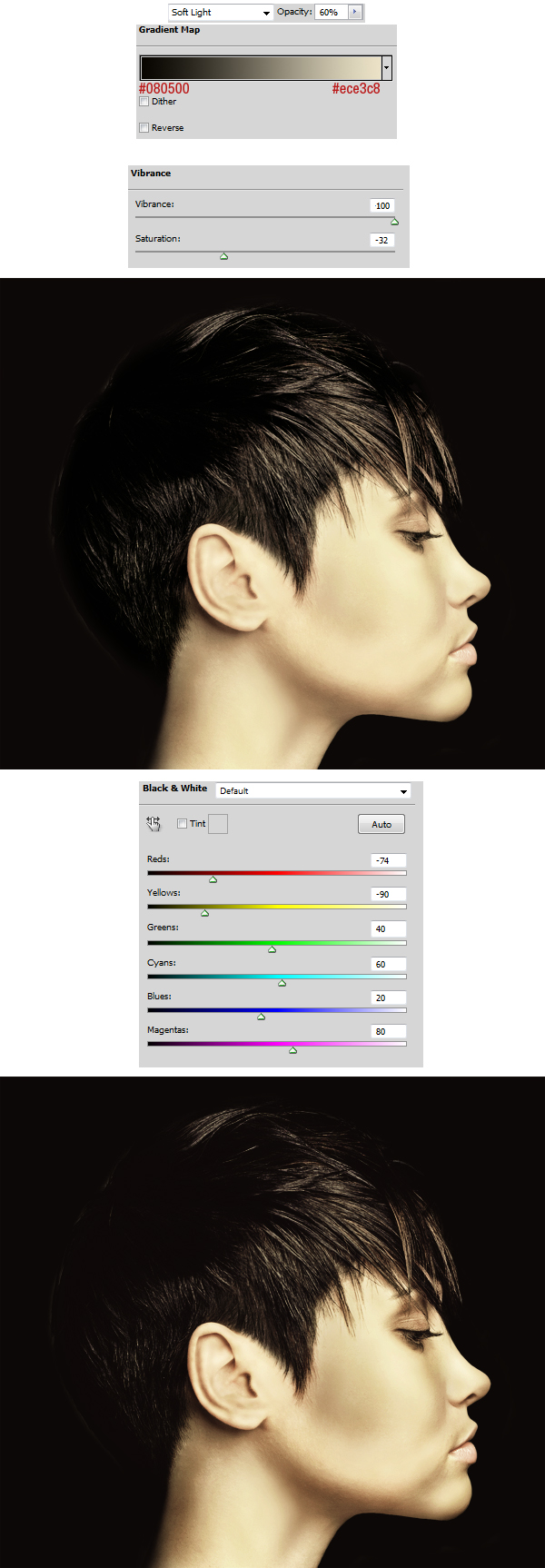
Now this brought us a little bit brighter and more textured result. Also the whites are not as intense as before but still this image lacks a lot. First, we need to get rid of the white and burned spots. From now on we’re going to use only adjustment layers in layers palette. And while creating every single one we will use holding Alt key and select the option "Use Previous Layer to Create Clipping Mask".
Using this method apply adjustments in order: Selective Color (settings below) > Gradient Map (pick the Violet, Orange preset and use Layer Blending mode of Soft Light with Opacity of 23%) > Hue/Saturation (turn the Saturation slider a little bit down).
Step 4
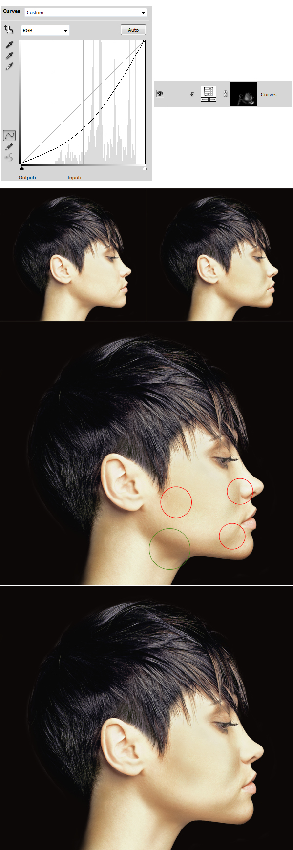
OK, cool. The face is now not so burned. Now let’s enhance the shading. Create a new adjustment layer Curves (using Clipping Mask as previously). Delete its Layer Mask, then go to Layer > Layer Mask > Hide All. In the Curves box pull the slider a little bit to the bottom right (1st image below). Then using a soft, white brush, paint on layer mask in darker spots to enhance shadows.
Next, look at 3rd image below (the one with circles). Create new layer (use Clipping Mask), grab very soft brush and hold Alt key to sample color from green circle. Then release Alt key to switch to brush and paint where red circles indicate. This will enhance the shadows even more.
Note: to get better results you can change layer’s Blending Mode to Multiply. But be careful, if the wrong color is picked – this may not necessarily get you what you want.
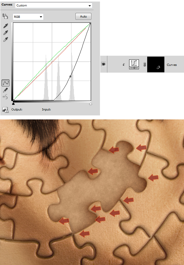
Step 5
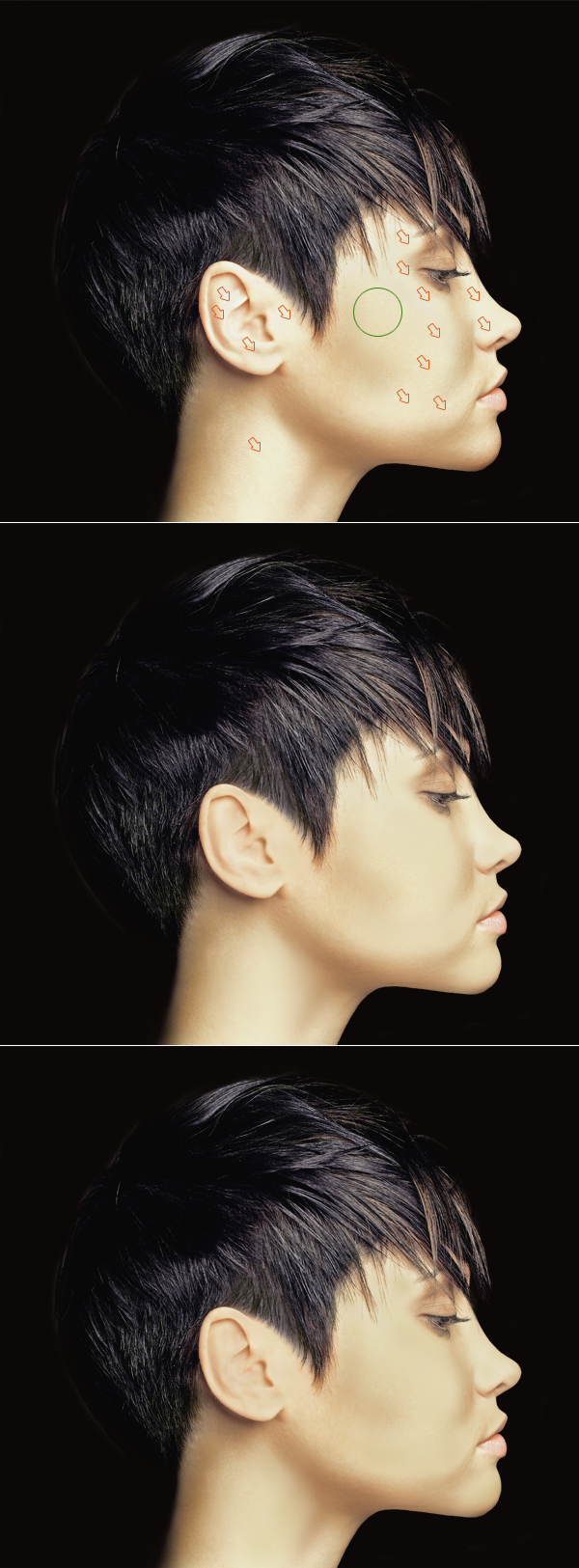
Using the previous method, do the same thing, but now take care of the highlights. With the difference that we don’t want to enhance them, we want to get rid of the white tones. So create new layer above (use Clipping Mask), sample color from green circle and paint where the red arrows indicate.
As you can see in the 2nd image below we have covered almost all the whites from her face. If you’re still not satisfied with the result, you can make those spots even more balanced by repeating this process with little bit darker color (3rd image below). It’s easy to overdo that, so be careful.
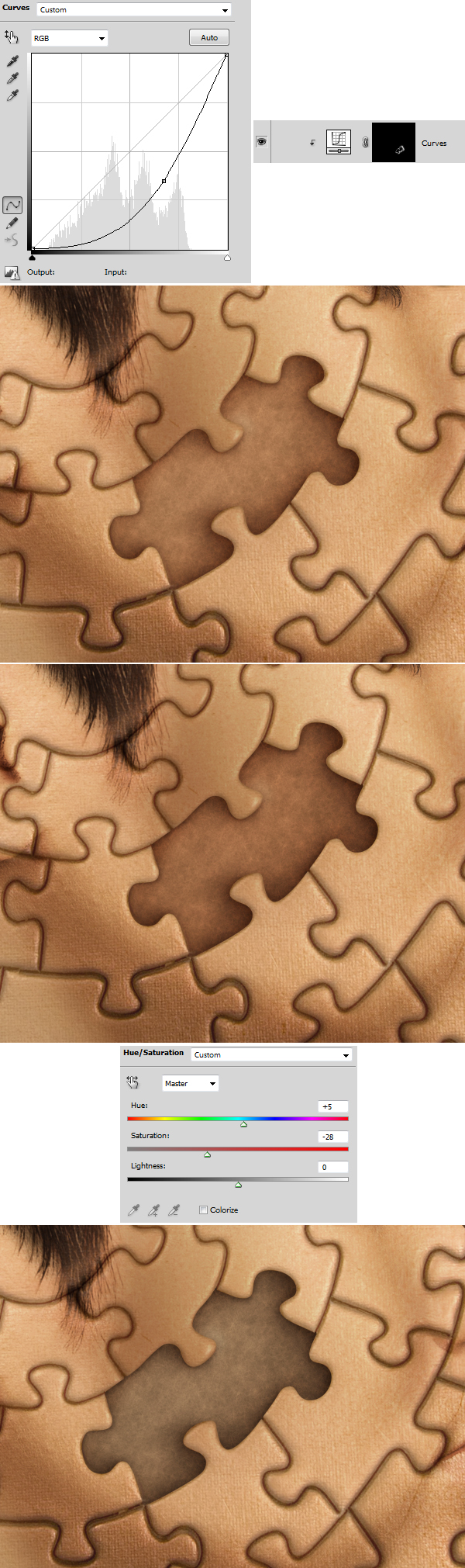
Step 6
Is this image looking bad now? Yes, someone can say "what the heck? This doesn’t work for me". But this is the reason I never let any client into my project until it reaches some final points. Several actions will bring this image to a whole new level.
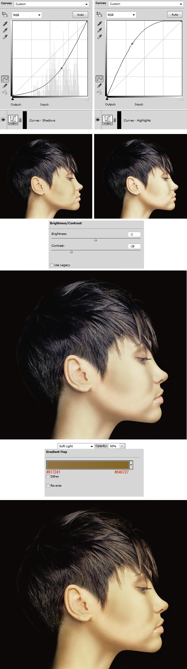
Using the knowledge from previous steps create two new adjustment layers (use Clipping Masks), removed their layer masks and add Layer > Layer Mask > Hide All to both. Pull the sliders as shown below. Then again using very, very soft brush with white color, enhance shadows painting on Curves – Shadows layer mask and then enhance highlights paining on Curves – Highlights layer mask. Second image shows the comparison before/after.
Next go for more adjustments, apply: Brightness/Contrast (settings below) and Gradient Map (settings below).
Step 7
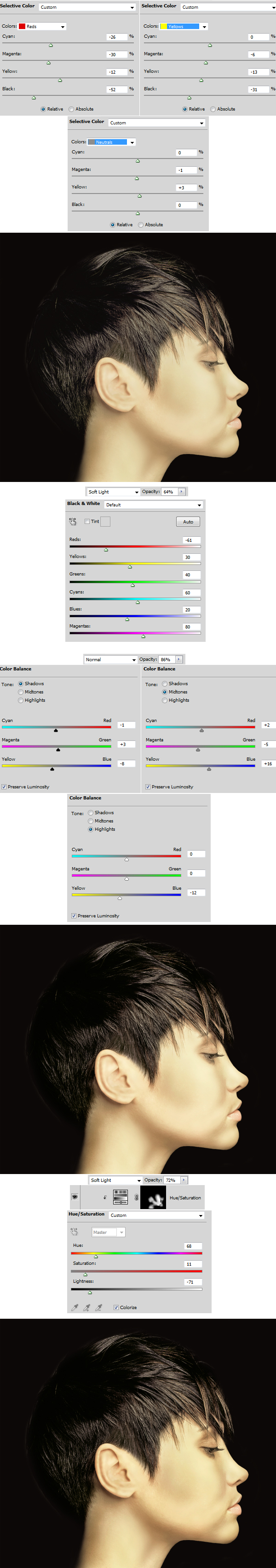
The mass adjustment layering is the result of experimenting. This is necessary when our image has some bad shadows, lights or is just over burned. Now apply Selective Color (settings below), Black & White (settings below), Color Balance (settings below), Hue/Saturation (delete Layer Mask, and apply Layer > Layer Mask > Hide All, use settings below and paint on mask in the highlight face spots).
Note: Each adjustment layer from images below has an adjustment result photo directly below.
Step 8
OK, we’re on the right track. After these adjustments we should be done with corrections. Gradient Map (settings below), Vibrance (CS5 option, you can slightly replace it with proper settings of Hue/Saturation), Black & White (use Soft Light Blending Mode and set the values as shown below, also be careful here, this adjustment layer gives pretty high contrast and increases the black and white depth).
Note: some of these adjustments are repeated, and it’s done with a purpose. They work differently when applied above or below particular adjustments.
Step 9
The final retouched image looks really cool. If you compare it to the raw photo, you will see a huge quality difference. Obviously we could make it more perfect by playing around more and more. But we’re going to add a texture on it so that kind of result is really fine for now.
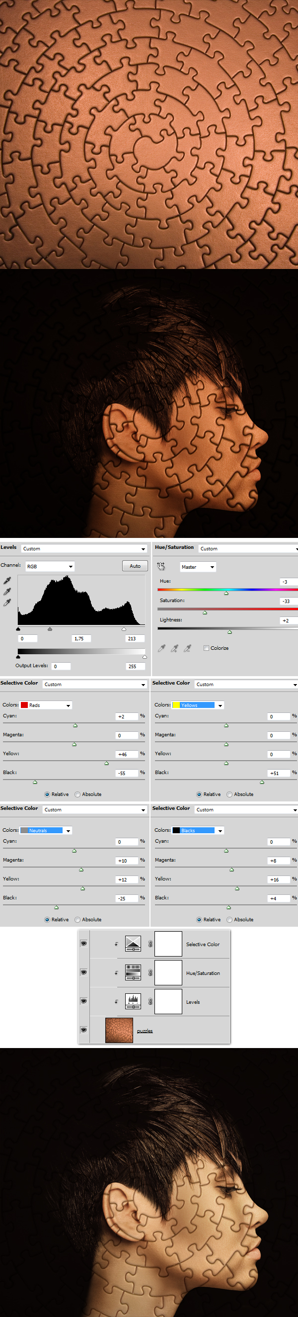
Open the puzzle image, drag it to our main project document and place it properly. Change the puzzle layer’s Blending Mode to Multiply. This layer needs to be on the top of layers palette (don’t use Clipping Mask here). Then, above this layer create: – Levels (settings below) – Hue/Saturation (settings below) – Selective Color (settings below) and now use Clipping Mask for those 3 adjustment layers.
Step 10
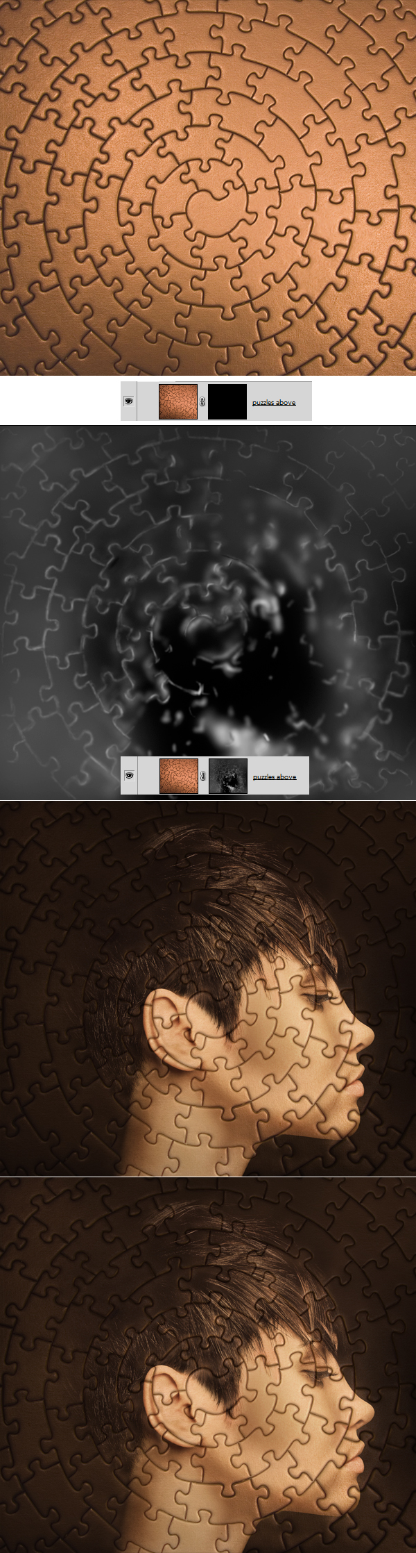
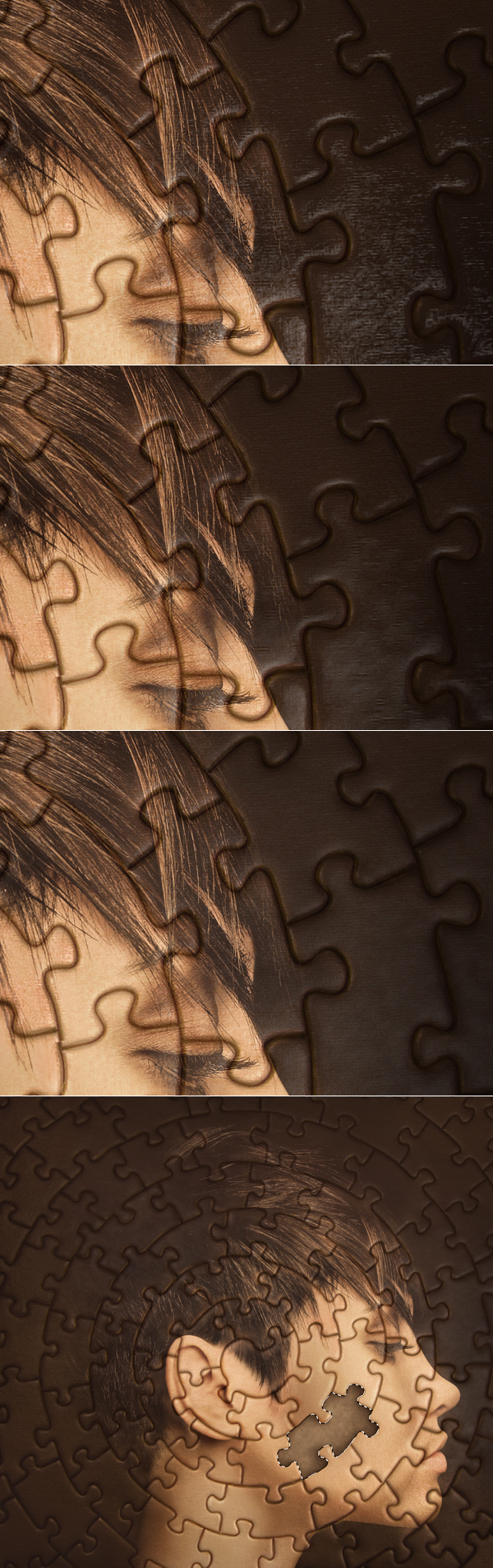
Simple Multiply never works properly; this gives a flat and cheap effect. So we will enhance it using some painting tricks. Duplicate the puzzle layer and place it above all layers (don’t use Clipping Mask here). Go to Layer > Layer Mask > Hide All. Here is the most important thing to do, you need to be very accurate. Grab very soft white brush and paint on Layer Mask revealing puzzle texture (2nd image below). This is important, as you need to slightly reveal the texture of whole puzzle shape using big size brush. Then using very small 2-3px brush enhance the spaces between puzzles. This will bring up the puzzle shape and give more realistic look.
Step 11
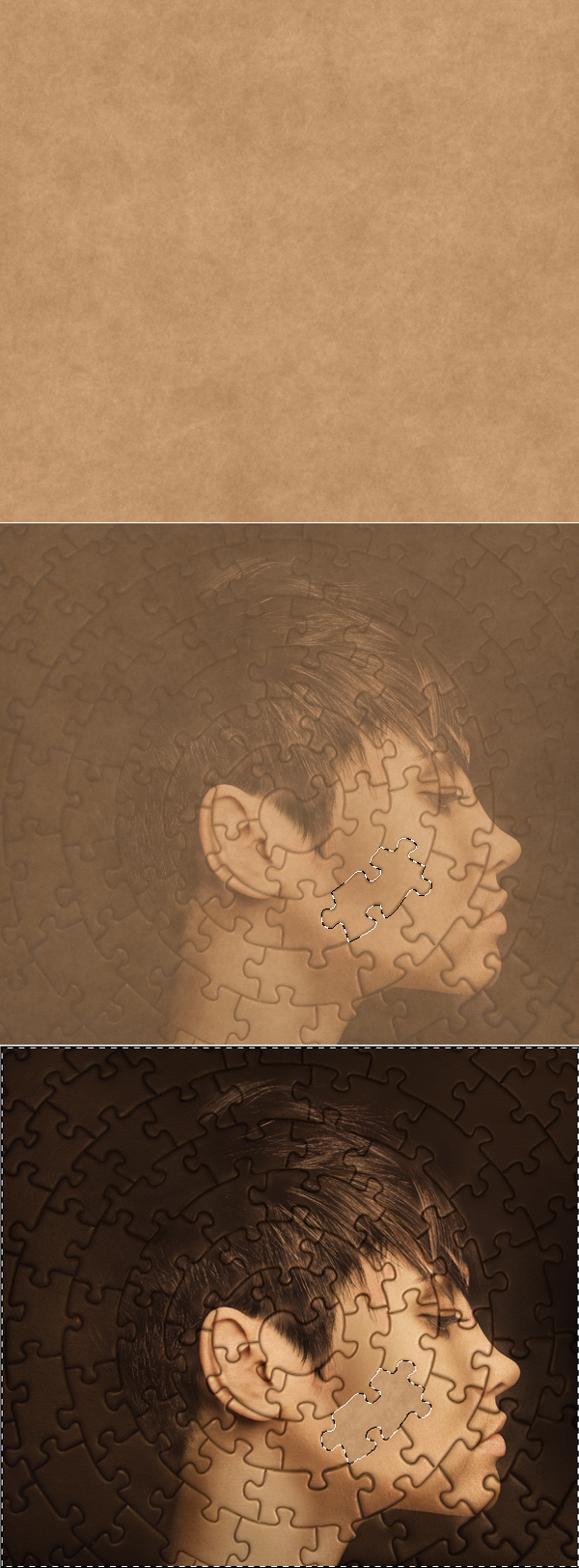
Now we will apply a missing puzzle part. You can use any paper texture that you want. Open it and drag on the top of our Layers Palette. Grab Pen Tool and draw a puzzle shape of your own choice, turn it into selection when you’re done. Hit Command/Ctrl + Shift + I to inverse selection and delete the surrounding texture (3rd image below). It’s good to lower opacity of the paper texture for the time of cutting the puzzle (2nd image below), but remember to bring back the 100% visibility of texture when you’re done with extraction.
Step 12
Now stick new Curves adjustment layer to the paper texture using Clipping Mask. Adjust it as shown below. Also delete the layer mask and go for Layer > Layer Mask > Hide All. Then grab soft white brush and paint on the mask to create shadows in indicated spots (2nd image below).
Step 13
Repeat the same process from the previous step and enhance the puzzle inner shadow. Add as much shadow as you find necessary. Next, to make it more real apply another adjustment layer – Hue/Saturation (use Clipping Mask). Desaturte it slightly.
Step 14
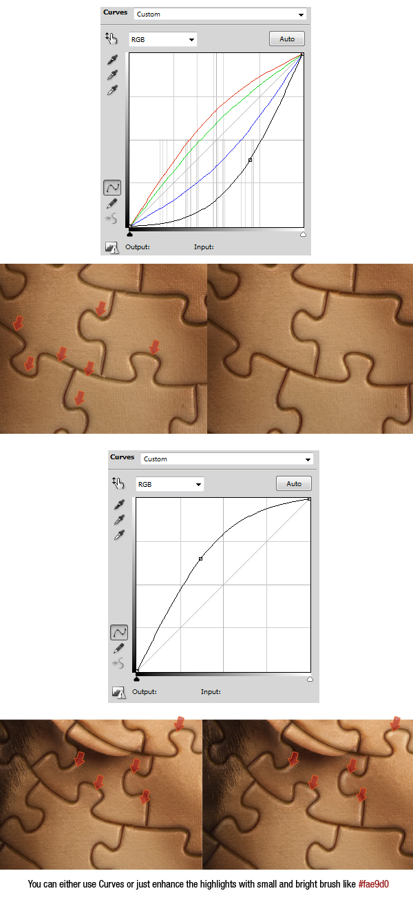
Next thing to do is using the same technique (add Curves > apply Layer > Layer Mask > Hide All > use Clipping Mask) adjust it as you see in the 1st image below. Then paint with white on Layer Mask to enhance shadows in puzzle spaces (2nd image below).
Repeat the same process (add Curves > apply Layer > Layer Mask > Hide All >use Clipping Mask), but this time set the slider to the top left (3rd image below). Then paint with white on Layer Mask to enhance the highlights on puzzle edges (4th image below).
You can also enhance these highlights using a new, normal layer and painting on it with bright color.
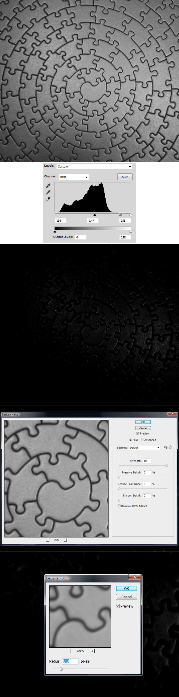
Step 15
Now we will give some nice realism to the image. Duplicate the puzzle layer, name it "puzzle light" and move it on the top of Layers Palette. Next, follow the images below: 1) Desature it using Command/Ctrl + Shift + U. 2) Add Levels adjustment layer (use Clipping Mask) and darken the puzzles to bring out only the hardest light spots. 3) Check if the result is similar to mine. 4) Apply Filter > Noise > Reduce Noise (settings below). 5) Apply Filter > Blur > Gaussian Blur (settings below).
Step 16
Now change this "puzzle light" layer’s Blending Mode to Screen and lower the Opacity to 80-90%, and you should receive something that looks similar to 1st image below. If you want the effect to be less textured go to Filter > Noise > Reduce Noise, and apply it 2-3 times with previous settings (2nd-3rd images below). Also remember that we don’t want this puzzle light effect applied in place of a missing puzzle. So call the selection of this puzzle shape (Command/Ctrl + click) and hit delete on "puzzle light" layer (4th image below).
Step 17
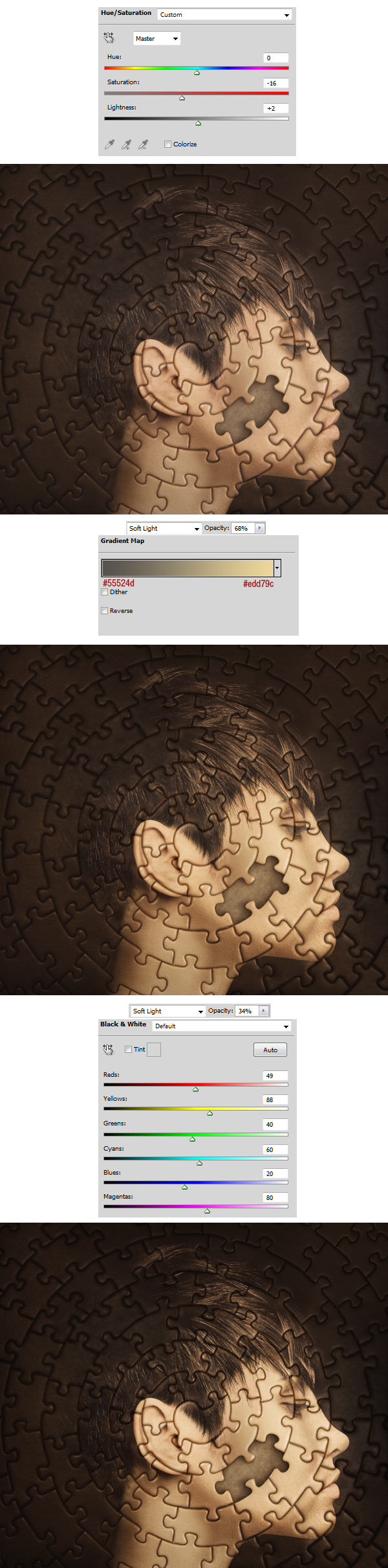
OK, great. From now on we will only apply adjustment layers to all the layers, there won’t be any clipping masks. We need to affect the whole canvas for final adjusting. So now go to the top of Layers Palette and create Hue/Saturation adjustment layer there (1st image below). Then add Gradient Map adjustment layer and set it as shown below (3rd image), change its Blending Mode to Soft Light and set the Opacity to 60-70%. Next add Black & White adjustment layer (settings in 5th image below), change its Blending Mode to Soft Light and set the Opacity to 30-40%.
Step 18
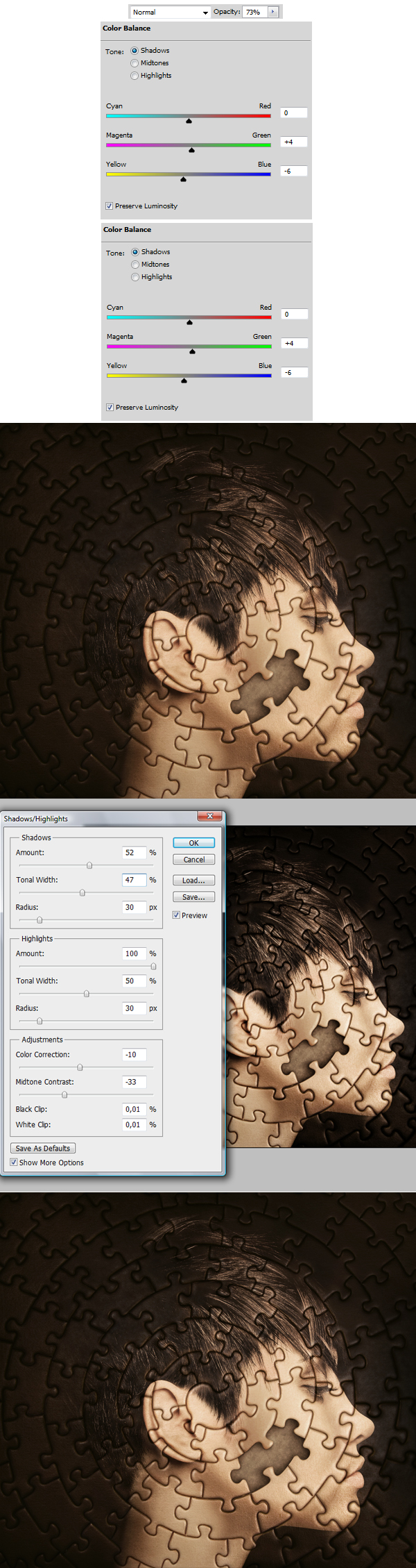
We’re almost done. Now all these final adjustment are done to give even more realistic look. So let’s touch it up with Color Balance (adjustments in 1st-2nd images below, result in 3rd). Then hit Command/Ctrl + Shift + Alt + E to copy/paste whole canvas to new layer, desturate it using Command/Ctrl + Shift + U, change its Blending Mode to Soft Light, then go to Image > Adjustments > Shadows/Highlights then play around with settings (4th image below). The Soft Light Blending Mode will give you live preview of the effect we’re creating right now. When you’re done, it’s good to lower opacity of this layer (to about 30-50%) as the shadows and lights seem to be too fat in full layer visibility.
Step 19
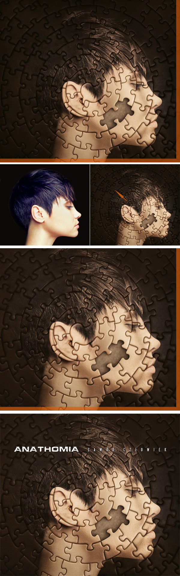
Everything seems looking really great right now, but there are always some unexpected surprises. As you can see, at the first image below I just brought again my cutting margin. Now when the face was nicely blended in the background you can see that hair part from the left side almost totally disappeared. This image no longer looks like it’s centered. So it’s a great thing that we have this image in resolution of 600px/inch, as this won’t hurt if we slightly make it bigger. To do this hit Command/Ctrl + Shift + Alt + E, this will copy and paste the whole canvas, and then use Command/Ctrl + T to transform and resize. After making it bigger, I dragged this image a little bit to the top left. Now it looks centered and if we turn on our margin for cutting it looks acceptable. So for the final, you can apply the desired title and find the most comfortable place for it.
Step 20
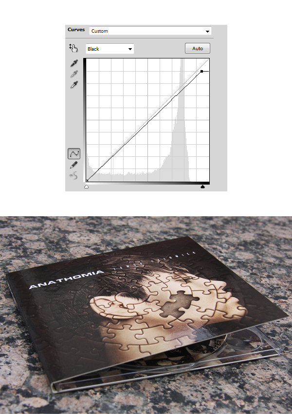
This is the way I created front of this cover. Try to remember to keep rest of the design in the same mood and the same or at least similar color scheme. Also before you send it for printing, it’s good to make sure if the whole design isn’t too dark. It’s always good to copy whole canvas and paste it in new document: 1) Command/Ctrl + A (select whole canvas). 2) Command/Ctrl + Shift + C (copy whole visible canvas). 3) Command/Ctrl + N (create new layer, and at this point pick CMYK as Color Mode). 4) Command/Ctrl + V (paste your design in the new document).
At this point everything depends on your project colors, so it’s kind of personal stuff for adjusting. Anyway to brighten the darkest spots in my cover I just did a slight adjusting of Curves – Black (Alt + 6).
Conclusion
So we have reached the end. Thanks for reading and I hope that you have found the information useful. Good luck with your own creative album covers!
0 comments:
Post a Comment